The Ultimate Guide to Bar charts: Everything You Need to Know

Bar charts are one of the most widely used forms of data visualization. They offer a clear, straightforward way to display information and make comparisons between categories. Whether you’re a data scientist, a business analyst, or just someone who loves a good graph, understanding bar charts is essential. In this guide, we’ll dive into everything from the basics of bar charts to advanced tips for using them effectively.
What is a Bar Chart?

The Basics of Bar Charts
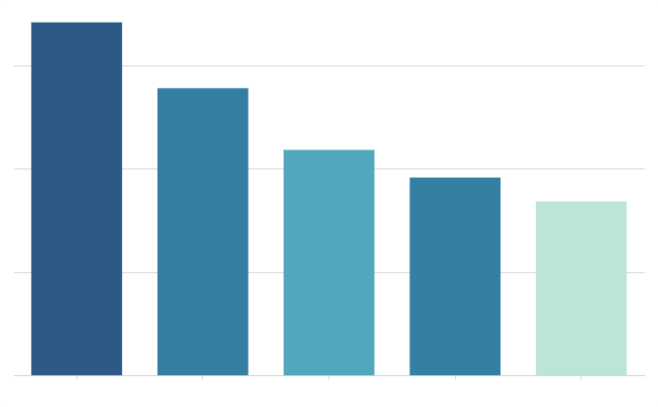
At its core, a bar chart is a graphical representation of data using rectangular bars. Each bar’s length or height corresponds to the value it represents. can be oriented either horizontally or vertically, depending on the nature of the data and the preference of the user. The X-axis typically represents categories, while the Y-axis represents values.
Bar charts are particularly useful when you want to compare the quantities of different categories. For example, if you want to compare sales figures across different regions, a bar chart allows you to quickly see which regions are performing better or worse.
Types of Bar Charts
There are several types of , each suited for different types of data:
Vertical : These are the most common and are used when comparing quantities across different categories. Each bar’s height represents the value of the category it corresponds to.
Horizontal : These are useful when you have long category names or when the categories are more naturally compared along the horizontal axis. They offer a clear view of the data, especially when dealing with a large number of categories.
Stacked: These show how different parts contribute to the whole. Each bar is divided into segments representing different sub-categories, allowing you to see both individual contributions and overall totals.
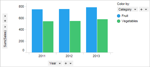
Grouped : Also known as clustered , these are used to compare multiple sets of data within the same categories. For instance, you might use a grouped bar chart to compare sales figures for different products within various regions.
Advantages of Bar Charts
offer several advantages:
Clarity: They straightforwardly present data, making it easy to see comparisons between different categories.
Versatility: They can be used to display both discrete and continuous data and can be adapted for different types of comparisons.
Ease of Interpretation: Most people are familiar with , making them an effective choice for communicating data to a wide audience.
How to Create a Bar Chart
Step-by-Step Guide
Creating a bar chart involves a few key steps:
Gather Data: Start by collecting the data you want to display. Ensure that your data is accurate and categorized appropriately.
Choose the Right Type: Based on your data and what you want to convey, decide whether a vertical, horizontal, stacked, or grouped bar chart is the best fit.
Select a Tool: You can create using various tools, such as Microsoft Excel, Google Sheets, or specialized data visualization software like Tableau.
Input Data: Enter your data into the tool you’ve chosen. For most tools, you’ll input your categories and values, and the software will generate the chart for you.
Customize the Chart: Adjust colors, labels, and other elements to make the chart more informative and visually appealing. Ensure that your chart is easy to read and interpret.
Review and Refine: Before finalizing your chart, review it for accuracy and clarity. Make sure that it effectively communicates the data and that there are no errors.
Tools for Creating Bar Charts
Several tools and software options can help you create bar charts:
Microsoft Excel: Excel is a versatile tool that allows for the creation of various types of charts, including bar charts. Its user-friendly interface and extensive customization options make it a popular choice.
Google Sheets: Similar to Excel, Google Sheets offers easy-to-use charting tools. It’s especially handy for collaborative projects due to its cloud-based nature.
Tableau: For more advanced data visualization, Tableau offers powerful features and customization options. It’s ideal for creating interactive and complex bar charts.
Online Chart Makers: Websites like Canva and ChartGo provide user-friendly interfaces for creating bar charts without needing advanced software skills.
Best Practices for Creating Effective Bar Charts
To make sure your bar charts are as effective as possible, keep the following tips in mind:
Label Clearly: Ensure that all axes and bars are clearly labeled. This helps viewers quickly understand what the chart represents.
Use Consistent Scales: Maintain consistent scales on the axes to avoid misleading representations of the data.
Limit Colors: Use a limited color palette to avoid overwhelming the viewer. Stick to colors that enhance readability and contrast.
Avoid Clutter: Keep the chart clean and free of unnecessary elements. Focus on presenting the data as clearly as possible.
Provide Context: Include titles and legends where necessary to provide context and make the chart easier to interpret.
Analyzing Bar Charts
Interpreting Bar Charts
Interpreting bar charts involves looking at the lengths or heights of the bars to understand the values they represent. Comparing the bars allows you to see which categories are higher or lower in value. For instance, if you’re looking at a bar chart of annual sales, a taller bar indicates higher sales.
Pay attention to trends and patterns within the chart. Are there noticeable peaks or dips? Are some categories consistently higher or lower than others? This analysis can provide insights into the data and help inform decisions.
Common Mistakes to Avoid
When analyzing bar charts, be mindful of common pitfalls:
Ignoring Scale: Make sure you pay attention to the scale of the axes. A chart with an improperly scaled axis can misrepresent the data.
Overlooking Context: Without context, it’s easy to misinterpret a chart. Always consider the source and relevance of the data.
Comparing Inconsistently: Ensure that you’re comparing like with like. For instance, don’t compare data from different periods or categories without accounting for differences.
Real-World Applications
Bar charts are used in a wide range of fields and applications:
Business: Companies use bar charts to track sales, compare performance across departments, and analyze market trends.
Education: In educational settings, bar charts help visualize test scores, student performance, and demographic data.
Healthcare: Healthcare professionals use bar charts to track patient statistics, treatment outcomes, and resource allocation.
Government: Government agencies utilize bar charts to present census data, budget allocations, and economic indicators.
Advanced Techniques for Bar Charts
Customization and Design Tips
To elevate your bar charts beyond the basics, consider these advanced design tips:
Interactive Elements: Adding interactive elements like tooltips or filters can enhance the user experience and make the chart more engaging.
Annotations: Use annotations to highlight significant data points or trends. This can help guide the viewer’s attention and provide additional context.
Dynamic Data: Implementing dynamic data updates allows your chart to reflect real-time changes. This is particularly useful for dashboards and live data feeds.
Custom Colors and Styles: Tailor the colors and styles to match your branding or to better highlight important aspects of the data.
Integrating Bar Charts with Other Visualizations
Combining bar charts with other types of visualizations can provide a more comprehensive view of the data:
Combination Charts: Use combination charts to overlay bar charts with line charts or other types of charts. This can help compare different data sets or visualize multiple aspects of the same data.
Dashboards: Incorporate bar charts into dashboards that include other visual elements, such as pie charts, maps, and tables. This holistic approach provides a richer understanding of the data.
Heat Maps: Combine bar charts with heat maps to show the intensity or frequency of data across different categories.
Using Software and Tools Effectively
Maximize the potential of your chosen tools by exploring their advanced features:
Excel: Utilize advanced Excel features like pivot charts and slicers to create interactive bar charts and perform in-depth analysis.
Tableau: Take advantage of Tableau’s extensive customization options and interactive capabilities to create sophisticated bar charts and dashboards.
Google Sheets: Explore Google Sheets’ integration with other Google services and its ability to collaborate in real-time for enhanced data visualization.
Case Studies: Bar Charts in Action
Business Case Study: Retail Sales Analysis
A retail company used bar charts to analyze monthly sales data across different regions. By comparing the height of the bars, they identified the highest and lowest-performing regions. This analysis helped the company reallocate resources and adjust marketing strategies to boost sales in underperforming areas.
Education Case Study: Student Performance Tracking
An educational institution used bar charts to track student performance across various subjects. By visualizing test scores, teachers were able to identify areas where students struggled and tailor their teaching approaches accordingly.
Healthcare Case Study: Patient Treatment Outcomes
A healthcare provider used bar a powerful tool for visualizing data and making comparisons between categories. Whether you’re a novice or an experienced analyst, understanding how to create, interpret, and customize